
Anna von Lipa. A brand redesign and photography approach for a company renowned for its exquisite fusion of Bohemian glassmaking traditions and Scandinavian design—crafting handcrafted glassware that elevates everyday moments.
Anna von Lipa. Same but different.


The project had three key milestones. We began with strategy, built an identity around it, and wrapped everything into comprehensive online brand guidelines — a go-to resource for ensuring consistency and cohesion across the brand.
The challenge was to modernize the brand and appeal to new markets while preserving its deep connection with existing customers. We began by redesigning the heritage symbol, evolving it into a new logo. This approach honored the brand’s past while introducing something fresh and contemporary.

Once the foundation was set, we introduced a new layer to the communication—a celebration of everyday beauty. To smoothly shift from product-focused messaging to a purpose-driven approach, we emphasized moments of everyday beauty, elevating product shots with a warm, cozy atmosphere that reflects the joy of home and daily rituals.
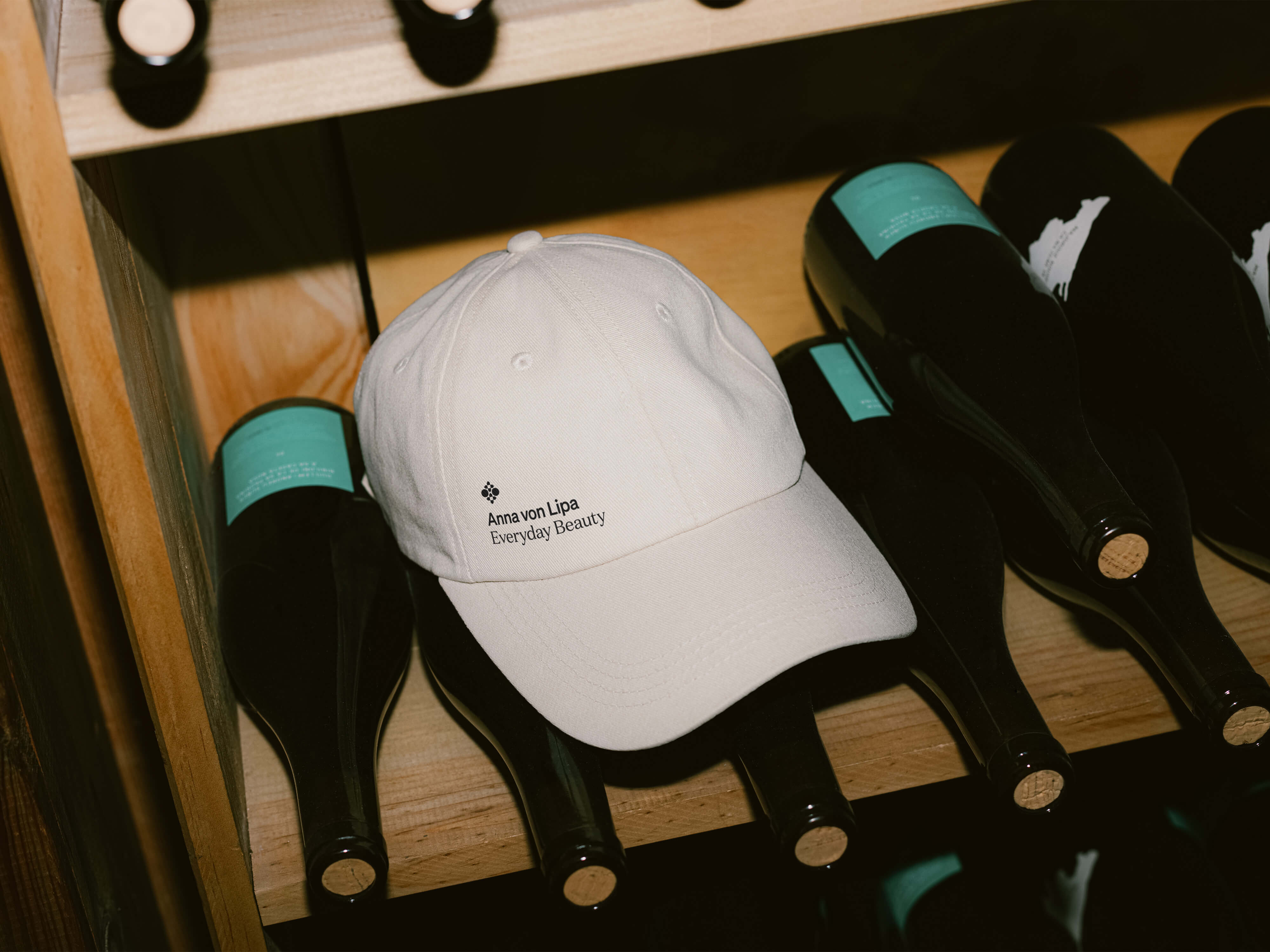

We keep the layout and photography simple, allowing the product and the moment to create a natural emotional connection. Everyday beauty is not about grand, staged scenes but about the small, authentic moments that make daily life special. By focusing on real, intimate settings, we ensure that the brand feels warm, relatable, and true to its purpose.
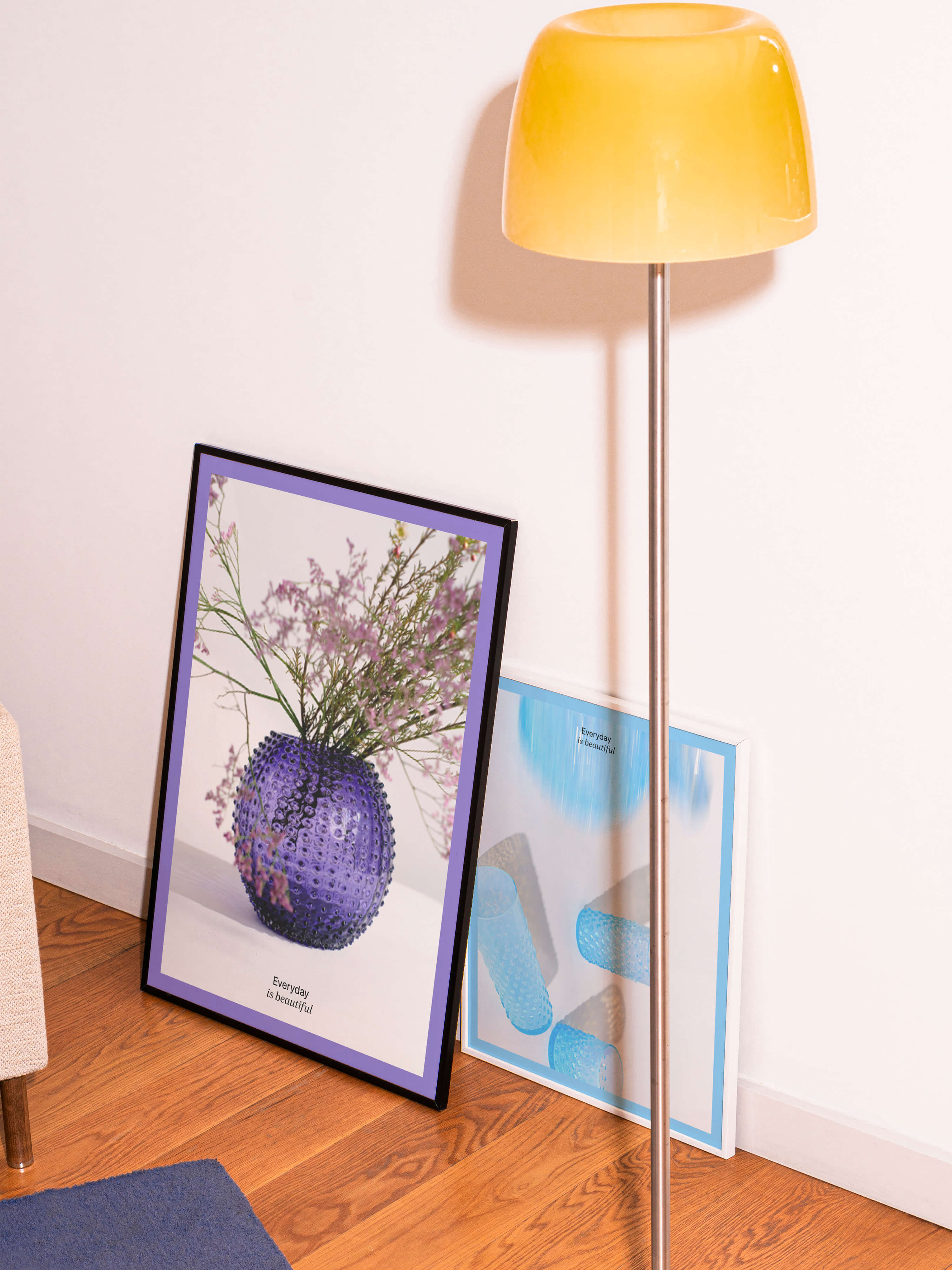
When a single product moment isn’t enough to convey the brand’s essence, we introduce repetition and layering as key visual elements. By showcasing multiple perspectives, overlapping compositions, or subtle variations of the same product, we create a sense of rhythm and depth. This approach not only enhances the visual storytelling but also reinforces the brand’s positioning through layout.


Exhibitions and fairs are a key part of the brand’s communication mix. To support this, we developed a modular exhibition system built from aluminum profiles and simple polycarbonate sheets. The result is a clean, approachable design that puts the spotlight on the products. The system is designed for easy assembly and reusability, allowing it to be dismantled and reassembled multiple times. This makes it a more sustainable alternative to traditional single-use stands. The exhibition design was created in collaboration with one and only Ing. arch. Jan Blažek.

Everyday beauty can also serve as a powerful tool for internal communication. It reinforces the idea that aesthetics are not limited to the extraordinary but exist in the textures, materials, and moments of daily life. The industrial setting captured on the fabric transforms a functional workspace into an artful composition—an understated tribute to craftsmanship and authenticity, reminding us that beauty is found in the process as much as in the final product.


Since the rebrand, Anna von Lipa has strengthened its recognition in international markets, retained its loyal customer base in Denmark, and expanded its global reach, proving that heritage and innovation can coexist beautifully. See it in action brand.annavonlipa.com.
Anna von Lipa has long been known for its exquisite blend of Bohemian glassmaking traditions and Scandinavian design, creating handcrafted glassware that brings beauty to everyday life. Founded by Danish designer Jytte Correll after a life-changing visit to Prague in the early 1990s, the brand built a strong presence in Denmark while staying true to its artisanal roots. In 2024, Anna von Lipa was acquired by Glassworks Jilek, one of Central Europe’s oldest glass factories, with the ambition to expand globally without losing its heritage or its loyal Danish audience.
The challenge lay in refreshing the brand to make it contemporary and attractive to new markets while maintaining its deep connection to its existing customers. At L–AB, we seamlessly integrated brand strategy and design to develop a revitalized identity that balanced tradition with modernity. Through market research and strategic positioning, we crafted a visual language that respects the legacy of Bohemian craftsmanship while appealing to a wider audience.
The new brand identity utilizes a refined color palette and typography that harmonize Scandinavian minimalism with the richness of traditional glasswork, ensuring a seamless evolution of the brand. We added a new approach to photography showcasing the beauty of handcrafted glassware – highlights the unique qualities of the glass and the artistry behind it. The photography and design layouts strengthens the brand’s commitment to quality, tradition, and transforming everyday moments into something extraordinary. Eco-conscious packaging reinforces the brand’s sustainability values while maintaining a luxurious, handcrafted feel. Since the rebrand, Anna von Lipa has strengthened its recognition in international markets, retained its loyal customer base in Denmark, and expanded its global reach, proving that heritage and innovation can coexist beautifully. See it in action brand.annavonlipa.com.
Brand strategy: in-house
Brand design: in-house
Photography: in-house
Brand standards: in-house
Logotype prototyping: OoM Type
Video production: Petr Macháček
Expo stand: Ing. Arch. Jan Blažek
3D logo design: Jakub Rous